Posts

Week 12 - Charts

Image
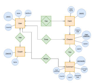
Entity Relationship Diagrams A clear chart can be effective between understanding various aspects including a simple recipe or an entire organization chart showing command hierarchy. It is important to have these charts within companies as well as part of an instruction manual. Step by step or relationship connectors are effective for many distinct aspects of life.  As we learn additional AI studies it is shown these relationship diagrams help computers connect different relationships or procedures therefore the intelligence gained by a machine can be compared to a human mind. Robots and self-driven cars have the intelligence to react to certain outside factors providing them with a real response, these responses are closed researched, I can envision relationship diagrams are used to give a clear path of direction for reactions.  As related to a company hierarchy the importance of these charts can assist in many different ways. As simple as a receptionist need to know who to...

Week 11 Job Market Prep

Image
Job Market Prep The job market is a very confusing place right now. Confusing to the extent depending on what type of job you are looking for there could be a very high possibility you can find it. This idea is depending on your skills and education it is possible to land a great job. It seems easy to obtain employment right now, after COVID lots of people quit their jobs or realized it was possible to work from home. Lots of people became creative and found ways of making money while being home. For a mom who has young kids, the pandemic became a chaotic time. Kids homeschooled or online school, preparing meals, keeping up with home. Working became the least of many people's worries. People left their jobs therefore the job market is at a good place right now for those who want to work.  On the opposite end, companies have taken the pandemic and so many technology developments to replace the jobs that have become obsolete. It is important now to familiarize ourselves with the most...

Tableau Public

Image
  Tableau Public is interesting and fun to use. It appears to me this is very similar to excel as far as the presentation goes it does seem enjoyable both to create and to use in a presentation. I would not mind using this for a future presentation where I need a visual similar to excel yet bringing more creativity and originality. The best part of Tableau is how simple it is to use. I tried to create a simple graph, the results did not disappoint me.  I tried to "compare" data in a visual the presentation was clear without the need for lots of explanations the point came across easily.  As I explored the website I came across the example below, which was my favorite. The colors and information are detailed yet simple to understand. Best graph I have ever seen. 

How to create an infographics

Image
 Creating an infographic begins by thinking of different ways to present my information. Important aspects of the infographics are presentation, relationship to the data, and attracting the preferred audience. So to begin I write down my ideas and create a plan. I picture the infographics and brainstorm where I will pull the data from and/or the pictures I would like to use to present. The next step is to then think about the audience I want to attract. It is important to consider the audience for me to present the information in the best way.  Once I type up my post, I search for the best pictures to represent the data I want to share. This step takes into consideration how I want to create the idea I have visualized. I save the pictures into my files, I place them on my infographic. The last step is to read my information to verify it is clear to understand. The information I write about has to relate to the pictures or graphs I used.  For this example, I am using a vis...

Week 8 - Think like a Designer

Image
As I begin to the of a plan to make an infographic which will captivate and motivate a buyer to do business with my friends cleaning company will have actual information but will be presented in a way which should grasp the attention of anyone. The following ideas I have for the infographic I would like to design has the following two components, a visual of the actual work done by the company and information about the company that is easy to understand. The visual or picture of an actual cleaning of a house to show the work that the company provides. This will give the potential buyer an expectation of what the company has to offer.  Seeing the work might motivate the buyer to give the company a try. I feel when you see actual work you are more likely to want to try the work or the product the company offers. The second idea of posting actual information of the company might be a good way to have the potential buyer to get to know the company and become familiar with who owns it...

week 7 - Contact businesses

As I brainstormed on who to contact I thought of two close family friends who have their own business. I also wanted to look into contacting a non for profit which could use some help with marketing.  Person 1: My childhood friend owns his cleaning business where he offers both residential and commercial cleaning. After he lost his job due to covid he started his own business which in the last 6 months has grown tremendously. Most of his advertising has been done on social media. However, he also spent a great amount of time passing out flyers to different residential areas and businesses. I contacted him on Monday, October 11, we discussed how his business was going and I mentioned my school project. He was highly interested in my working on an infographics for his business. I mentioned I had a couple other people to contact but I would get back to him if I decided to work on his.  Person 2: My brothers ex-wife works a full time job and also has a bakery business which she ru...

Week 6 - REDO past blog

Image
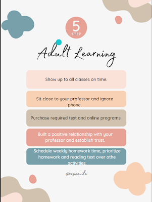
Updated Infographics I posted my original blog about adult learning on me snapchat asking for feedback. Most of the feedback I received was towards the clarity of the presentation. Most people who responded mentioned it was unclear and had too much going on. I searched for a layout which would have less graphics but use the same wording. I felt it was straight to the point and did not feel so heavy. I also felt the lighter colors on the second infographic provided a calm feeling versus my original which was very strong and felt aggressive. As, this class advances I have begun to realize many different components when creating and infographics. Colors, pictures, and font make a huge different depending on what the topic is or who the audience are. My original infographics for Adult Learning gave most people a childish creative thinking whereas my second one was more focused towards adults and specifically women.