Posts

Showing posts from November, 2021

Week 12 - Charts

Image
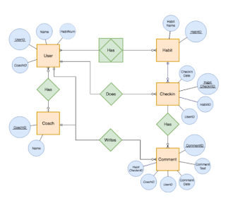
Entity Relationship Diagrams A clear chart can be effective between understanding various aspects including a simple recipe or an entire organization chart showing command hierarchy. It is important to have these charts within companies as well as part of an instruction manual. Step by step or relationship connectors are effective for many distinct aspects of life.  As we learn additional AI studies it is shown these relationship diagrams help computers connect different relationships or procedures therefore the intelligence gained by a machine can be compared to a human mind. Robots and self-driven cars have the intelligence to react to certain outside factors providing them with a real response, these responses are closed researched, I can envision relationship diagrams are used to give a clear path of direction for reactions.  As related to a company hierarchy the importance of these charts can assist in many different ways. As simple as a receptionist need to know who to contact

Week 11 Job Market Prep

Image
Job Market Prep The job market is a very confusing place right now. Confusing to the extent depending on what type of job you are looking for there could be a very high possibility you can find it. This idea is depending on your skills and education it is possible to land a great job. It seems easy to obtain employment right now, after COVID lots of people quit their jobs or realized it was possible to work from home. Lots of people became creative and found ways of making money while being home. For a mom who has young kids, the pandemic became a chaotic time. Kids homeschooled or online school, preparing meals, keeping up with home. Working became the least of many people's worries. People left their jobs therefore the job market is at a good place right now for those who want to work.  On the opposite end, companies have taken the pandemic and so many technology developments to replace the jobs that have become obsolete. It is important now to familiarize ourselves with the most

Tableau Public

Image
  Tableau Public is interesting and fun to use. It appears to me this is very similar to excel as far as the presentation goes it does seem enjoyable both to create and to use in a presentation. I would not mind using this for a future presentation where I need a visual similar to excel yet bringing more creativity and originality. The best part of Tableau is how simple it is to use. I tried to create a simple graph, the results did not disappoint me.  I tried to "compare" data in a visual the presentation was clear without the need for lots of explanations the point came across easily.  As I explored the website I came across the example below, which was my favorite. The colors and information are detailed yet simple to understand. Best graph I have ever seen.