Week 6 - REDO past blog
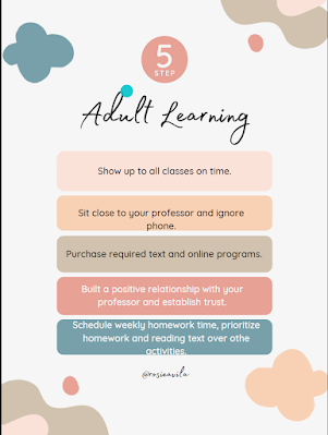
Updated Infographics
I posted my original blog about adult learning
on me snapchat asking for feedback. Most of the feedback I received was towards
the clarity of the presentation. Most people who responded mentioned it was
unclear and had too much going on. I searched for a layout which would have
less graphics but use the same wording. I felt it was straight to the point and
did not feel so heavy. I also felt the lighter colors on the second infographic
provided a calm feeling versus my original which was very strong and felt
aggressive.
As, this class advances I have begun to realize many different components when creating and infographics. Colors, pictures, and font make a huge different depending on what the topic is or who the audience are. My original infographics for Adult Learning gave most people a childish creative thinking whereas my second one was more focused towards adults and specifically women.


Comments
Post a Comment